My role 💁🏽♀️
Sole product designer, UX-UI.
Drift is an e-commerce brand specializing in fragrances for cars and home interiors. Following its acquisition by Scentbird in late 2022, the website was redesigned to align the product experience with the brand’s new strategic direction. My work then focused on conversion optimization through A/B testing and targeted iterations. This case study highlights several experiments that generated a significant impact on the site’s performance.

Sole product designer, UX-UI.
Since june 2023
As the sole Product Designer on the Drift website, I was responsible for all CRO tests conducted since June 2023.
The initial target was $2.5M in profit, which was exceeded.
More than 40 experiments were conducted.
Since the acquisition, the company’s value has tripled, with the business consistently overperforming expectations.
+$609k gross profit
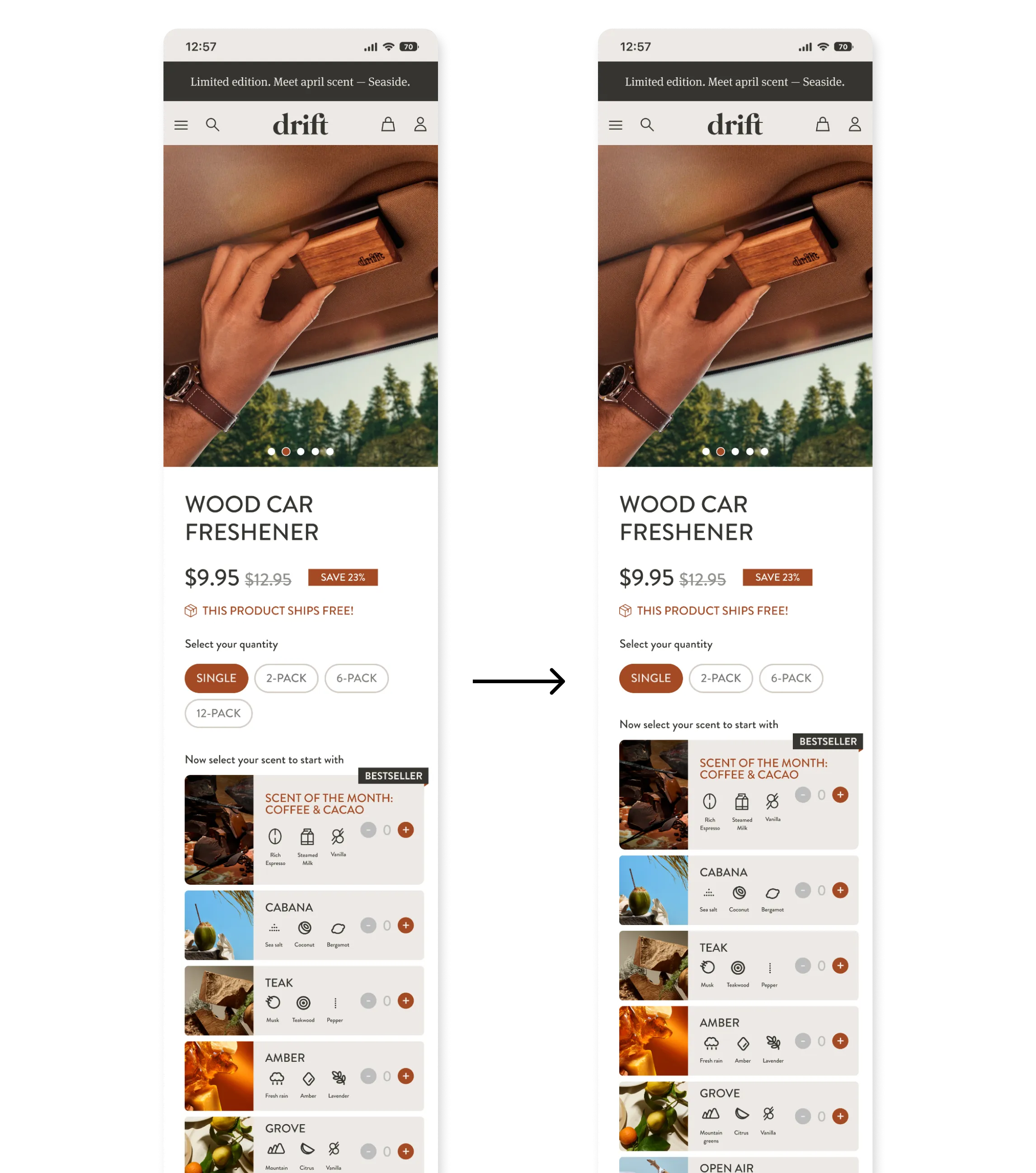
The fragrance selection on the product page relied primarily on text and featured a dated interface.
It did not allow users to easily project themselves into the olfactory universe of the products, nor to quickly understand what they would receive.
In addition, we wanted to give customers more control by allowing them to build their own fragrance selection.

UX principle: Mental imagery / Cognitive projection
Users are more likely to make a decision when they can mentally project themselves into the experience.
- Visuals compensate for the absence of a sensory experience (smell)
- They help users “imagine” the fragrance
- Reduced cognitive effort during decision-making
👉 Particularly effective for products that cannot be physically tested online.
+$ 530k profit uplift
The website was experiencing a high subscription cancellation rate, directly impacting retention and long-term customer value.
Customers were asked questions at the time of cancellation to better understand their motivations and the friction points behind this decision.
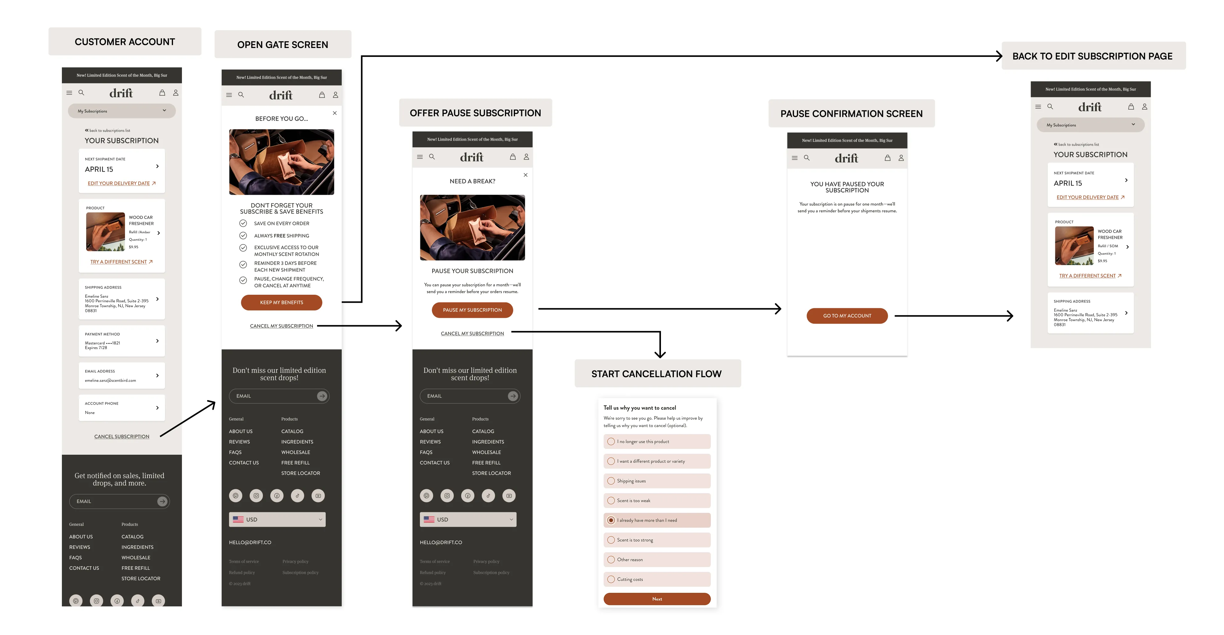
🥇 Loss aversion — primary lever
Users feel the pain of losing a benefit more strongly than the pleasure of gaining a new one.
By reminding users of:
- the value provided by the subscription
- what they would lose by canceling
The perceived value is reactivated at a critical decision moment.
👉 Particularly powerful for retention.
Choice architecture
Rather than blocking the user, the flow restructures the available options:
- Cancel
- Or pause the subscription
👉 Pausing becomes a psychologically “less drastic” and more acceptable alternative.
Cancellation flow
An intermediate screen was introduced in the cancellation flow to remind users of the key benefits of the subscription.
If the user still chose to cancel, a more flexible alternative was offered by allowing them to pause their subscription instead.
This simple flow optimization helped reduce cancellations and resulted in $530K in profit.
+$971k profit uplift
Following user interviews, we identified significant friction points on the product page. The actions required to add a product to the cart lacked clarity and created confusion—particularly around the concepts of starter pack and product type.
Users struggled to understand the different steps leading to purchase, which slowed down decision-making.

🧠 Cognitive Load Reduction
Users are more likely to convert when the amount of information to process and the number of decisions to make are reduced and clearly structured.
In this test:
- Too many unclear actions
- Too much information presented at the same level
- Too many abstract concepts (starter pack, refill)
👉 The redesign aimed to simplify decision-making and guide users more effectively toward purchase.
+$384k profit uplift
Sales performance analysis revealed that the 12 pack option generated significantly lower sales volume compared to the other available formats.
In this context, the hypothesis was that offering too many options could slow down decision-making and negatively impact conversion.
🧠 Paradox of choice (Choice overload / Choice paralysis)
The more options users are presented with, the harder it becomes to make a decision—and the less likely they are to act.
By removing the 12 pack option:
- The number of decisions to make was reduced
- The flow was simplified
- The path to purchase became clearer
👉 Fewer choices lead to more action.